I thought I'd put up a few of my favorite posters, in honor of this. (I particularly love his second design with the crow on the branches). Particularly when so many movie posters follow trends, such as this or these, and... voila:

Not that all of those are bad. The posters for 3:10 to Yuma and Walk the Line are beautiful, despite being sexy back. And The Dark Knight and The Descent are clever variations on the designed face trend.


I can't speak to the individual artists or the artistic movements any of these came out of. But here are some of my favorite posters, which don't look like every other photo collage in the multiplex these days. (I should mention - it was SUPER hard to narrow these down, and I'll be posting some other ones I like in other categories later.) In no particular order:

It looks like a carnival poster and it's unique.

I like the colors and the typeface on this. Plus Jane is in this demure position, while Rochester's emotive look fills her dress.

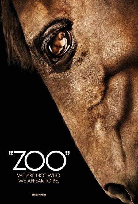
I love this. Its so different. And I love the Victorian type of nature drawings. Yet it gets across the movie being about skin.

I have no idea what this movie is, but it's a great poster. So happy!

I love the way the type is set on this, while it shows the main character dancing.

I love the distressed look of this.

This gets the point across. Without being as overt as certain banned Hungarian versions...

Such a great monster movie poster. Creepy, interesting colors, great type.

Okay - I might be a little biased, given that I love San Francisco and fog. But this is still great. Perfectly ominous. He's in the fog! Or Solano. Or Not!

I don't know this movie, but this is such a striking poster. Don't you just want to know what is going on there? Plus, I love how stylish it is.

Oh no! The dreaded orange and blue! But it is forgiven, because this is such a cool poster. I love the gaping Tasmanian tiger mouth, filling the space and set against the characters.

This is a special edition poster, but I think it is so perfect; dark, noir, and intriguing. .

This is so pretty. It's so lush and romantic.

One of the all-time greats.

I really like this. Rawr.

I adore this poster, much like the film! In fact, its the only one I have up on my wall. This image comes off a little lighter than it is in real life. BUT! You get the basic color scheme, and Lola's flame hair. Plus the splits.

This is great. It doesn't look like anything else out there, and it conveys the old-timey feel and impending conflict. (My only quibble, from a marketing standpoint is that it might look more action-packed than it is. But if the intent is to peak interest enough to provide an audience for a really good film, then this works.)

One of my absolute favorites. I think this is just so gorgeous.

Propaganda for movies! Viva la revolucion!

Another Andrea Arnold poster. (I should see what the Wuthering Heights poster looks like. Ah, here it is. Not as good, but I wonder if it'll get a new version for release.) Anyways, I love the architecture of this. I have yet to see this film, so I don't know if it is as foreboding as the poster, but I just love this.

New favorite! So bright and colorful and exuberant!

I love the color, and the Maori designs against the waves.
 This is so gorgeous. The movie it is for was not supposed to be very good, so let's just bask in the beauty.
 I don't know what this movie is, but this poster is bold, original, and eye-catching.

Not that all of those are bad. The posters for 3:10 to Yuma and Walk the Line are beautiful, despite being sexy back. And The Dark Knight and The Descent are clever variations on the designed face trend.


I can't speak to the individual artists or the artistic movements any of these came out of. But here are some of my favorite posters, which don't look like every other photo collage in the multiplex these days. (I should mention - it was SUPER hard to narrow these down, and I'll be posting some other ones I like in other categories later.) In no particular order:

It looks like a carnival poster and it's unique.

I like the colors and the typeface on this. Plus Jane is in this demure position, while Rochester's emotive look fills her dress.

I love this. Its so different. And I love the Victorian type of nature drawings. Yet it gets across the movie being about skin.

I have no idea what this movie is, but it's a great poster. So happy!

I love the way the type is set on this, while it shows the main character dancing.

I love the distressed look of this.

This gets the point across. Without being as overt as certain banned Hungarian versions...

Such a great monster movie poster. Creepy, interesting colors, great type.

Okay - I might be a little biased, given that I love San Francisco and fog. But this is still great. Perfectly ominous. He's in the fog! Or Solano. Or Not!

I don't know this movie, but this is such a striking poster. Don't you just want to know what is going on there? Plus, I love how stylish it is.

Oh no! The dreaded orange and blue! But it is forgiven, because this is such a cool poster. I love the gaping Tasmanian tiger mouth, filling the space and set against the characters.

This is a special edition poster, but I think it is so perfect; dark, noir, and intriguing. .

This is so pretty. It's so lush and romantic.

One of the all-time greats.

I really like this. Rawr.

I adore this poster, much like the film! In fact, its the only one I have up on my wall. This image comes off a little lighter than it is in real life. BUT! You get the basic color scheme, and Lola's flame hair. Plus the splits.

This is great. It doesn't look like anything else out there, and it conveys the old-timey feel and impending conflict. (My only quibble, from a marketing standpoint is that it might look more action-packed than it is. But if the intent is to peak interest enough to provide an audience for a really good film, then this works.)

One of my absolute favorites. I think this is just so gorgeous.

Propaganda for movies! Viva la revolucion!

Another Andrea Arnold poster. (I should see what the Wuthering Heights poster looks like. Ah, here it is. Not as good, but I wonder if it'll get a new version for release.) Anyways, I love the architecture of this. I have yet to see this film, so I don't know if it is as foreboding as the poster, but I just love this.

New favorite! So bright and colorful and exuberant!

I love the color, and the Maori designs against the waves.

No comments:
Post a Comment