A few more favorites in a variety of categories.
First up, some of my favorite Older Posters:

Really, it just matches the visuals in the film, but it is gorgeous.

I like the trompe l'oeil of this.

I love the colors on this. Also Jimmy Stewart has the world's largest binoculars.

This is so pretty. I wish more movie posters were paintings.

My favorite Saul Bass. I like the optic design. (Inspiring one of my favorite modern posters, which you will see in a bit.)
The Art Posters:

AAAAAHHHH. SO PRETTY.

Very original and interesting.

True story: In the town where I went to college, there was a bagel joint called 42nd Street Bagels, and the walls were covered in Broadway posters; some signed, some not. The largest and most eye-catching one was For Colored Girls... which I would stare at as I waited for breakfast. (Ooh! Broadway posters!) I feel that this one is equally as striking.

I love everything about this poster; the depth, the fog, the faintly visible lettering, the fade to white at the top. It's so alive.

Yes, the film is supposed to be terrible. And I might have done the quill slightly differently. BUT. I like how bold and different this is. Violent ink splatter!

I love the colors and styling here.

I love how this shows that the film is about changes in emotions in a simple, beautiful visual.
And, finally, the Clever Ads:

YES. It gets across the opulent lifestyle on display and it's totally arresting.

Storytime!

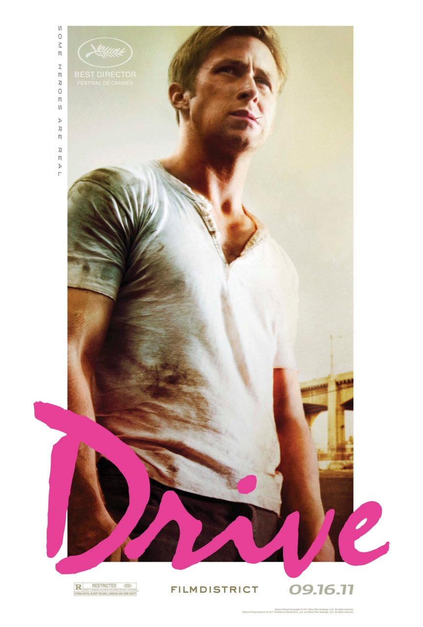
It was hard to pick between this version and the more commonly used version, which is even more 80s and iconic. But I like the darker tone of this one, plus it shows him behind the steering wheel, in his element. The perfect font is the same for both.

I'll bring up a little bit more of this marketing campaign later, but I adore this poster. A take-off on MC Escher, it highlights the characters (archetypes), the nostalgic, old-school feel, and the twisty plot.

MOOOOOOOON! Clearly influenced by Vertigo. Yay optics! (scroll up. scroll down. scroll up. scroll down...)

Simple, effective. This is a movie about a man buried in a coffin.
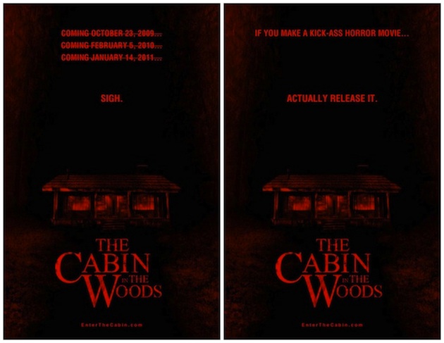
So the story behind Cabin is that it was filmed in 2009, but with MGM's bankruptcy (which necessitated finding distributors for other films, such as... oh.... the Bond franchise), Cabin didn't get released until 2012. I think these were mocked up in 2011, to vent frustration and remind Whedon fans about it.

One of the cleverest marketing campaigns. Signs like this were hung all over Comic Con 2008. The captivating image led people to find out more, discuss, and a tiny South African film got enough buzz and enough push for a big release and massive success.

Again: simple, captivating, bold. Little Red Riding Hood for a modern era.

Obviously slicker and more mass-marketed than some of the rest. But it is a nice spin (get it?) on the group photoshop.

Hee. It's a vampire bite that folds into the movie's Morse code.

Striking, colorful, fun.

I like this one a lot. It's such a great perspective. And it isn't just Brad Pitt's smiling face, which would be the obvious (and bland) way to sell this film. Also: the predominant green sets it apart from most other posters these days.

Also great. It doesn't look like every other poster out there and you get to see the film's leads through the Predator's eyes.

Heh.

Cute.

Striking. (Hey-o!) Obviously this grabs your attention; it is audacious and titillating. The pin-up as a poster. It has a great tagline and I like the distressed look of it (although I seem to recall seeing some of these without the aged effect.)

No comments:
Post a Comment